Pipeline Observability
Pipeline Observability gives you an easy interface to monitor the health, status, or logs of your data pipelines. It pulls pipeline data from GitLab in real-time through the GitLab GraphQL API and presents it in neat visuals.
At the top of the screen (header section), you can filter by DataOps Group, Project, Branch, pipeline status, and time range. As you adjust these filters, the charts on the main page update instantly.
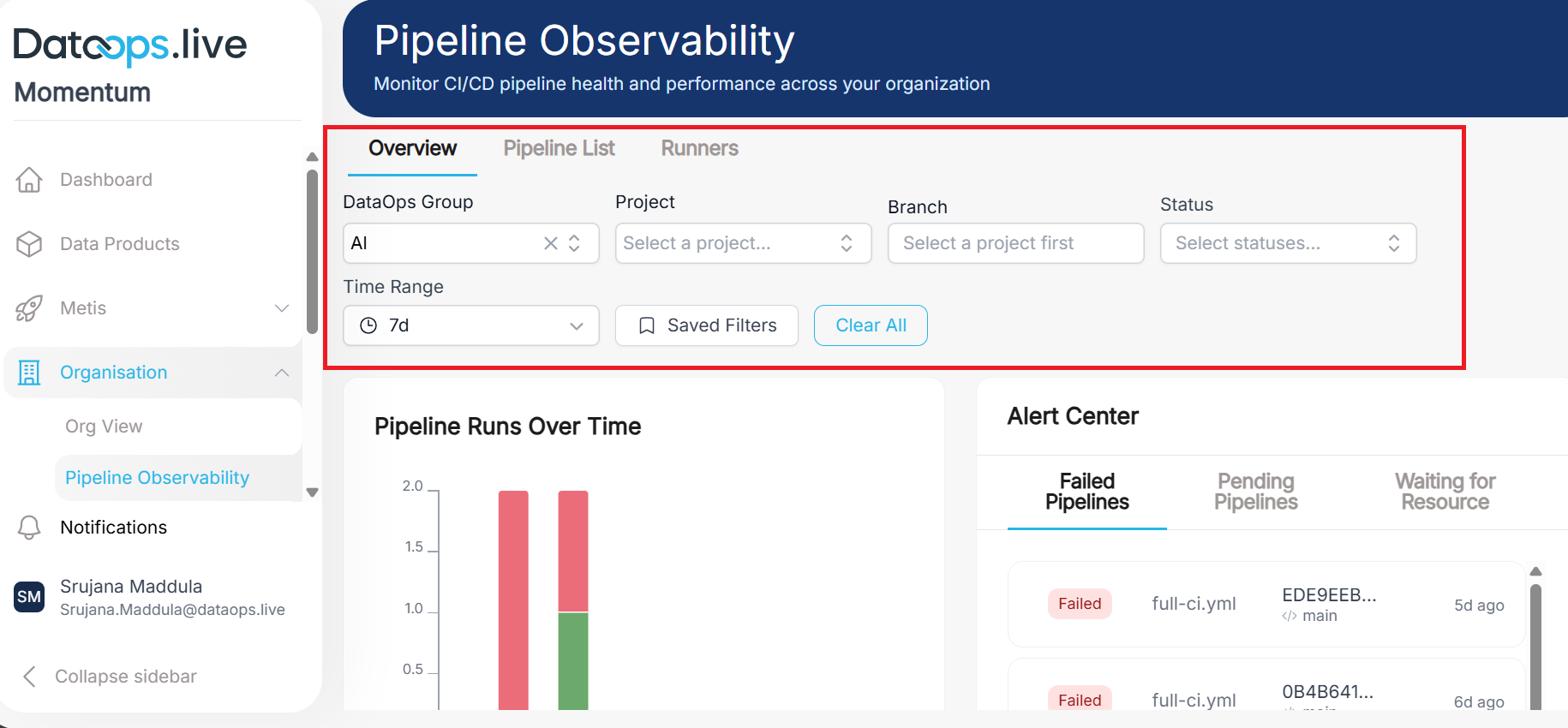
Overview tab
The “Pipeline Runs Over Time” chart shows how many pipelines run during each time period and whether they succeeded, failed, or are still running. Each bar represents a day (or hour, depending on your time range), and the height shows how many pipelines ran.
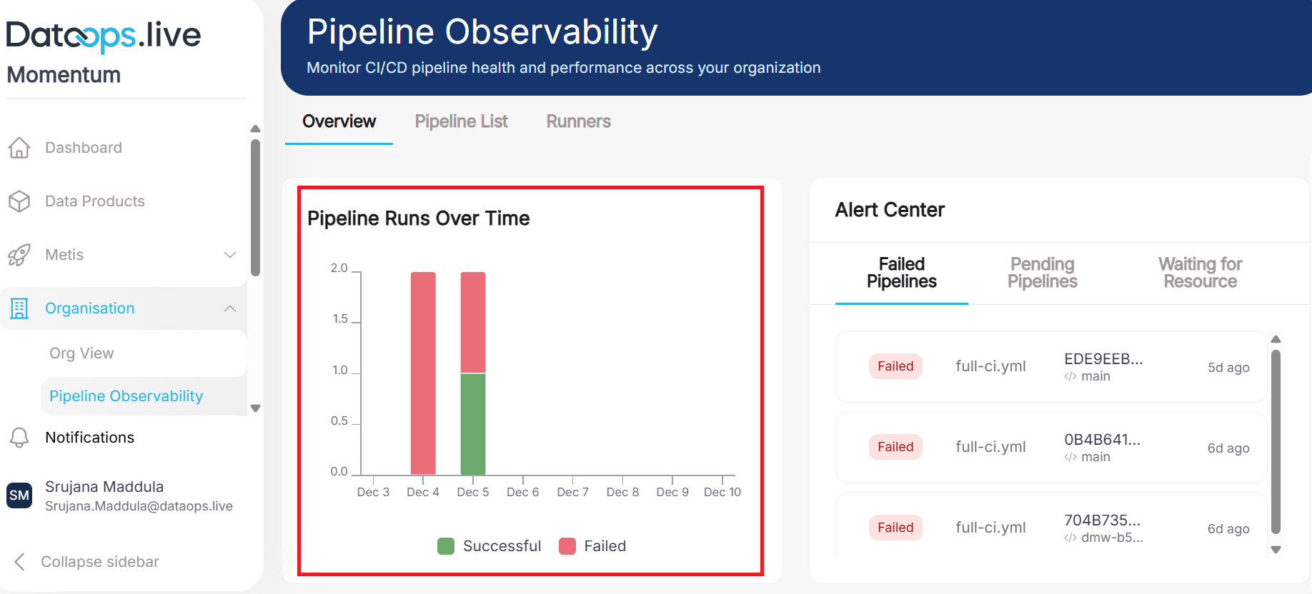
Each color on the bar represents a different pipeline status:
- 🟢 Green (Successful): Pipelines that completed without errors
- 🔴 Red (Failed): Pipelines that encountered errors and stopped
- 🔵 Blue (Running): Pipelines currently in progress
- 🟡 Yellow (Pending): Pipelines waiting to start
- ⚫ Gray (Canceled): Pipelines manually stopped by users
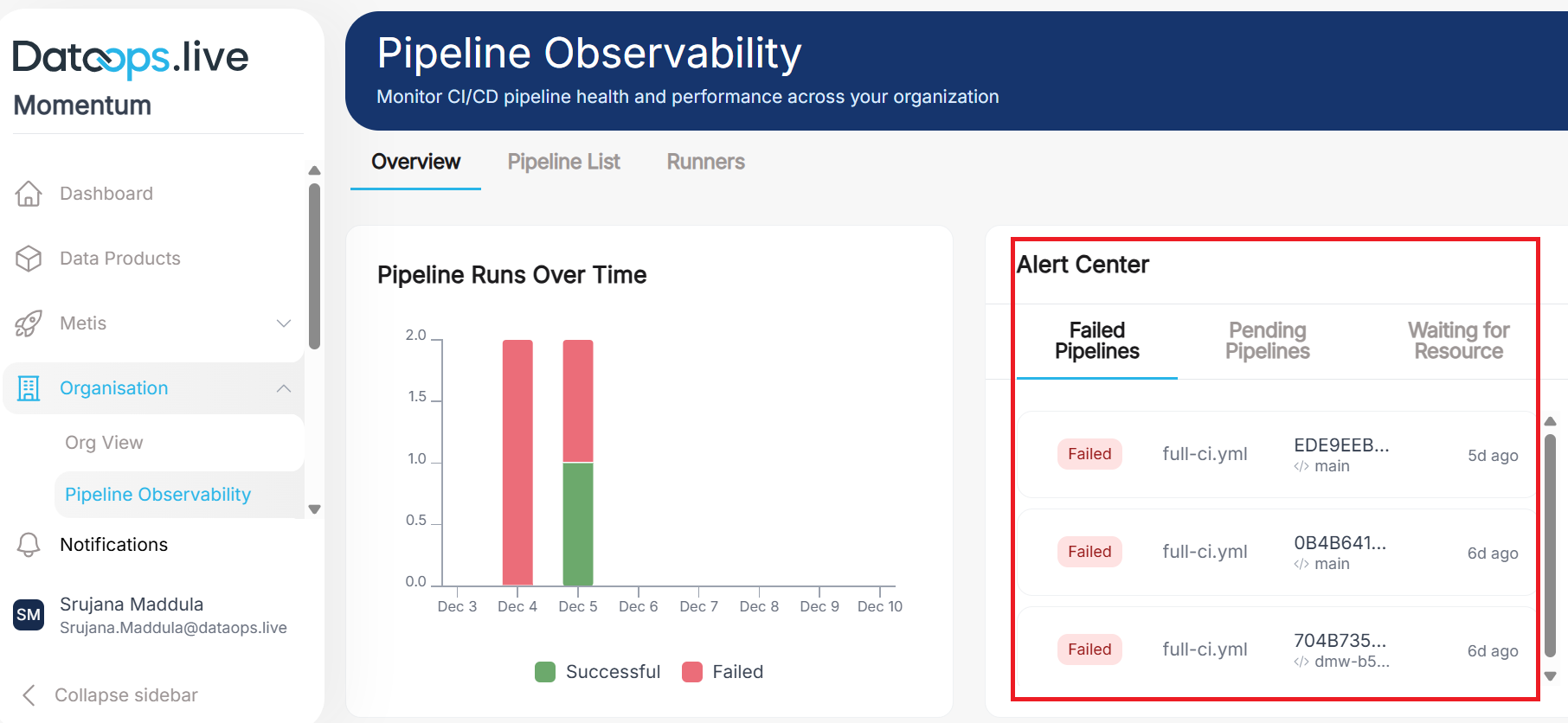
Alert center: The alert center on the right lists failed, pending, and waiting-for-resource pipelines across separate tabs. It gives you a quick view of recent failures and pending pipelines.
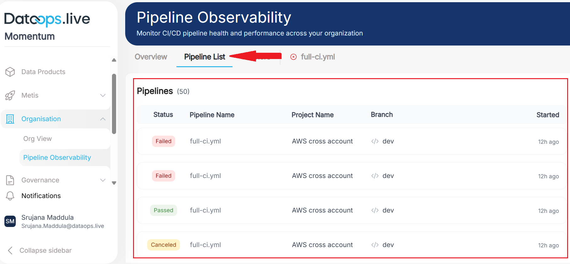
Pipeline List tab
The header section remains the same as discussed, with filters for DataOps Group, Project, Branch, and others.
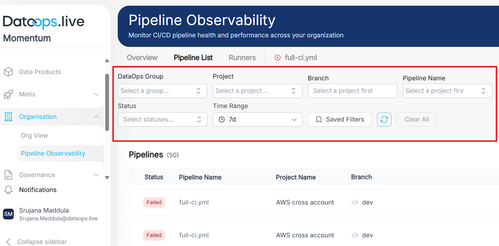
The main screen shows a full list of recent pipelines along with their status, name, and branch. If you want to see the latest pipeline runs, this is the go-to tab.
Runners
The Runners Tab provides complete visibility into your GitLab runner infrastructure, showing which runners are online, what jobs they're executing, and their current capacity.
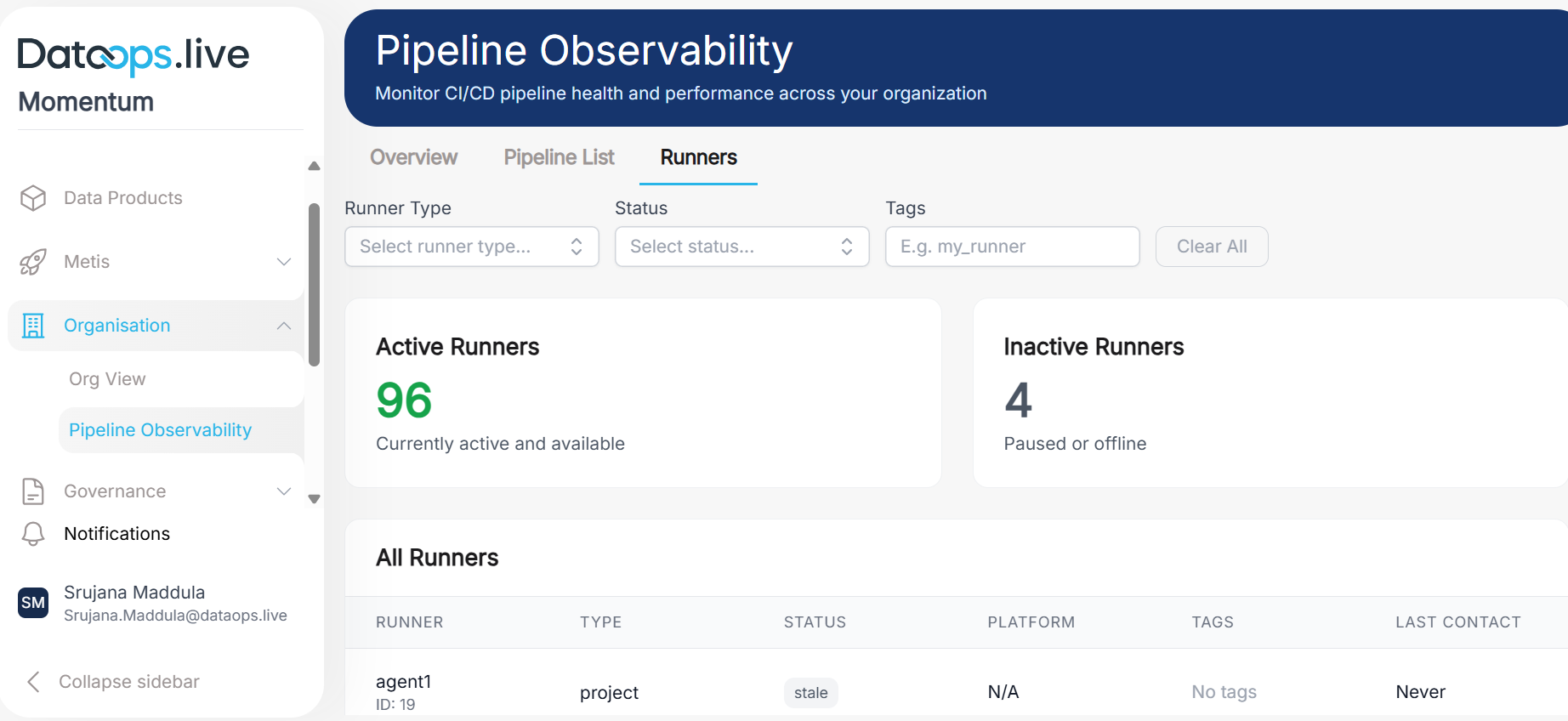
On the top, you can use filter controls to search and filter runners. Summary cards in the middle display counts for Active and Inactive runners.
In the main screen, a detailed table lists all runners with their status, tags, and other key details.