Usage Spend Summary
Spendview for Snowflake, the free module from DataOps.live observability, provides detailed insights from operational metadata across one or multiple Snowflake account usage. It helps understand how Snowflake account usage patterns impact overall expenses. It lets you monitor accounts' usage spend drivers in a centralized view.
Accessing Spendview for Snowflake
Ensure that you have added the Snowflake accounts you want to monitor to the Snowflake Accounts page in Spendview for Snowflake.
- Open Spendview for Snowflake in your browser.
- Enter your username and password in the open form and click Sign in.
- On the menu bar, click Usage to open a centralized view of the Snowflake accounts' usage spending.
Your access to the icons on the left sidebar depends on your role in Spendview. See Access levels and roles for more information.
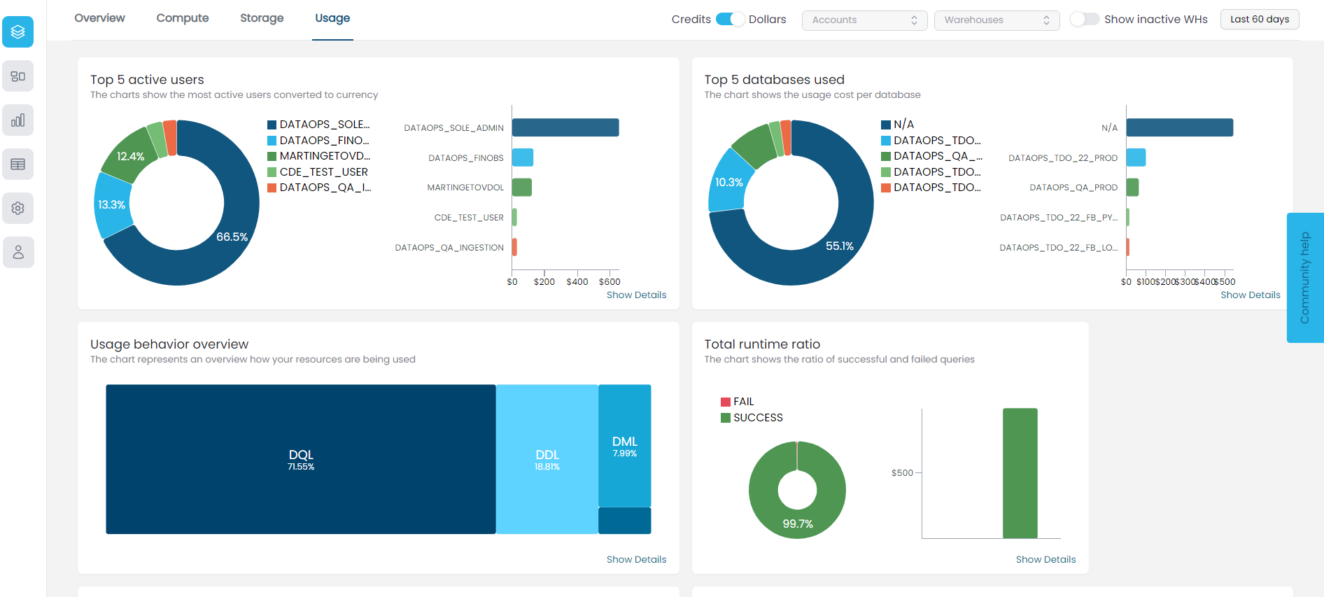
Overview
From the Usage page, you can visualize and analyze several graphical metadata representations about the usage of specific Snowflake accounts and drill down into the accounts' usage cost-driver issues in seconds.
Use the fields on the top bar to choose your datetime- and account-specific visualization options:
- To look at the usage cost of specific accounts, click in the Account field and select the accounts you want to monitor. Click Clear selection at the bottom of the list to remove your filter.
- To look at the usage cost of specific warehouses in the selected accounts, click in the Warehouses field and select the warehouses you want to monitor. Click Clear selection at the bottom of the list to remove your filter.
- To look at the usage cost during a specific datetime range, click in the date field and select the period you want to monitor.
- To show or hide all static warehouses in the selected accounts, toggle the Show inactive WHs option on or off.
Toggle on or off Credits or Dollars to show the credit score trends or the dollar score trends in the usage metrics.
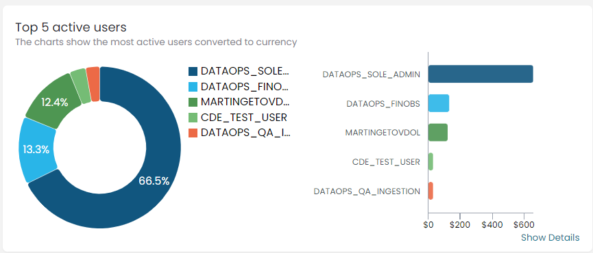
Top 5 active users
This chart shows the top 5 active users in the selected accounts and the spend of each user's queries per the chosen period.
- Point to a color on the pie chart or a bar to display the user usage ratio and query cost.
- Click Show Details on the bottom right to open more details listing usage overview for the selected accounts.
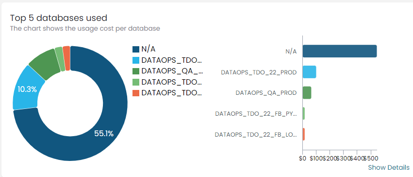
Top 5 databases used
This chart shows the top 5 used databases in the selected accounts and the spend per database.
- Point to a color on the pie chart or a bar to display the database usage percentage and cost.
- Click Show Details on the bottom right to open more details listing usage overview for the selected accounts.
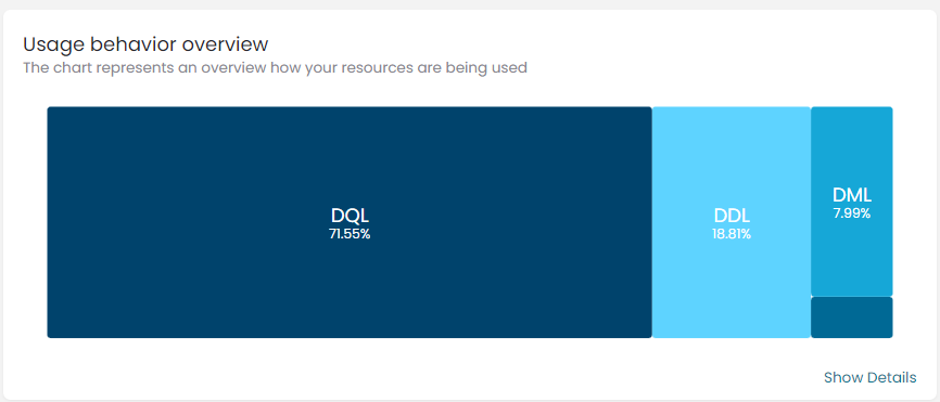
Usage behavior overview
This chart uses color codes to show your resource usage trends based on the different operations performed on the databases, including the Data Query Language (DQL), the Data Manipulation Language (DML), and the Data Definition Language (DDL).
- Point to a specific color or language to display the resource usage ratio and value.
- Click Show Details on the bottom right to open more details listing usage overview for the selected accounts.
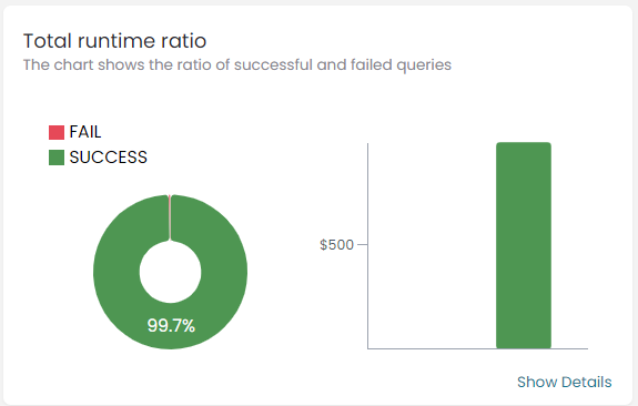
Total runtime ratio
This chart uses color codes to show the ratio of successful and failed queries.
- Point to a specific color on the pie chart or a bar to display the ratio of queries per status and cost.
- Click Show Details on the bottom right to open more details listing usage overview for the selected accounts.
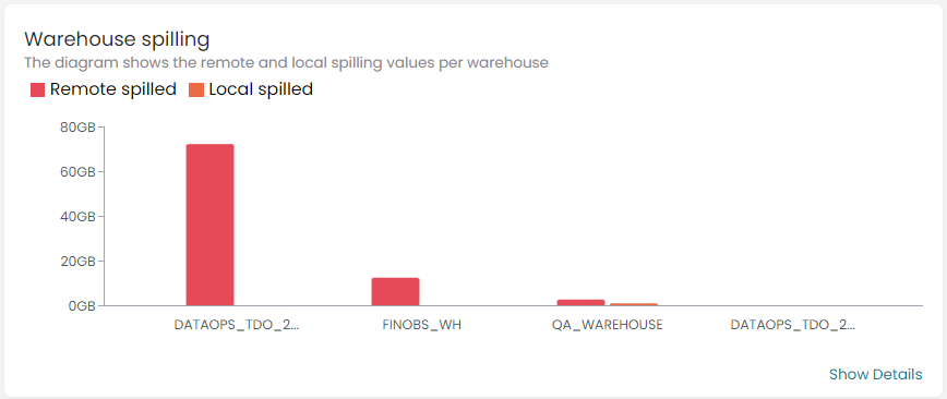
Warehouse spilling
This bar chart shows the amount of data stored on the local disk of each warehouse node and that written to the remote cloud storage where the warehouse cannot fit an operation in memory. Spilling is translated into performance degradation.
- Point to a bar to display the warehouse name and the spilling value.
- Click Show Details on the bottom right to open more details listing usage overview for the selected accounts.
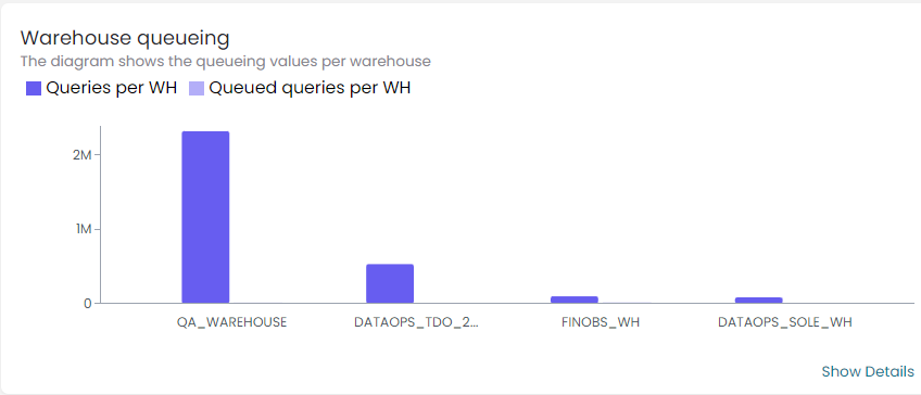
Warehouse queueing
This bar chart shows the values of the queries executed and those queued per warehouse in the selected accounts.
- Point to a bar to display the warehouse name and the query value.
- Click Show Details on the bottom right to open more details listing usage overview for the selected accounts.